Developing. Trying the ‘less is more’ approach but still trying to keep an Indian feeling. For colours I was thinking henna tones - deep browny reds. Golds and reds are some of my favourite tones together and to me represent India the most.
My boyfriend said it reminded him of a wedding invitation =)
My boyfriend said it reminded him of a wedding invitation =)
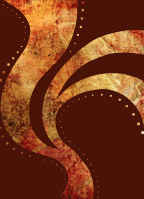
I think what I like about this is the fact that it still has an Indian feeling without stating the obvious through imagery like with the girl (below) … although I’m still happy with that poster.
I did this piece in Photoshop and Illustrator by using a cutout mask of the shape I drew up and scanned in and then put it over the textures I’d prepared.
Now for the typography…
I really love this piece of work, its so warm and exotic. The tones and texture is beautiful. Really fits that theme well.
ReplyDelete